Meet Your Crypto Bank Account
What has to be true on this screen
A settlement app for high-volume watch and diamond dealers.
What I own is that a first-time dealer trusts the screen enough to move six figures on it.
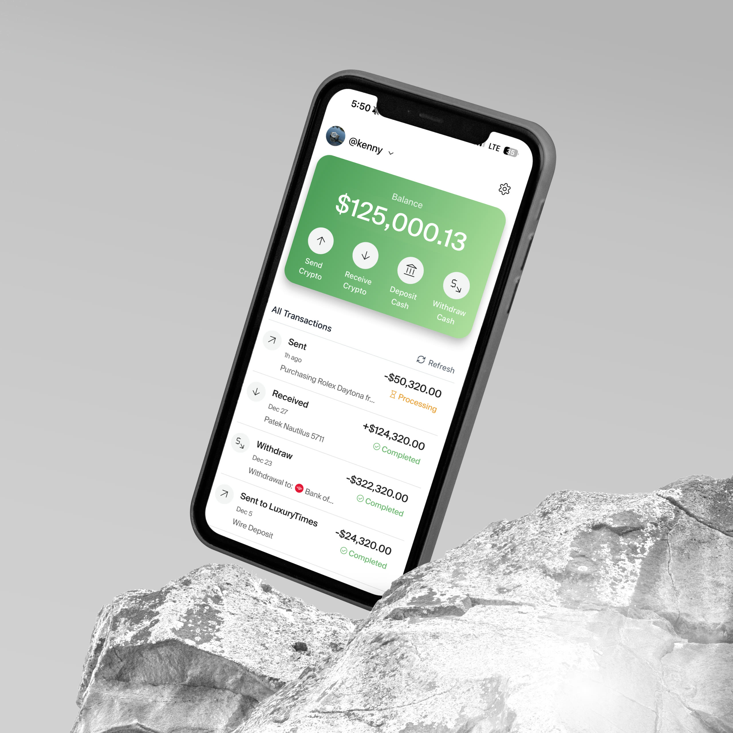
A settlement app for high-volume watch and diamond dealers.
What I own is that a first-time dealer trusts the screen enough to move six figures on it.
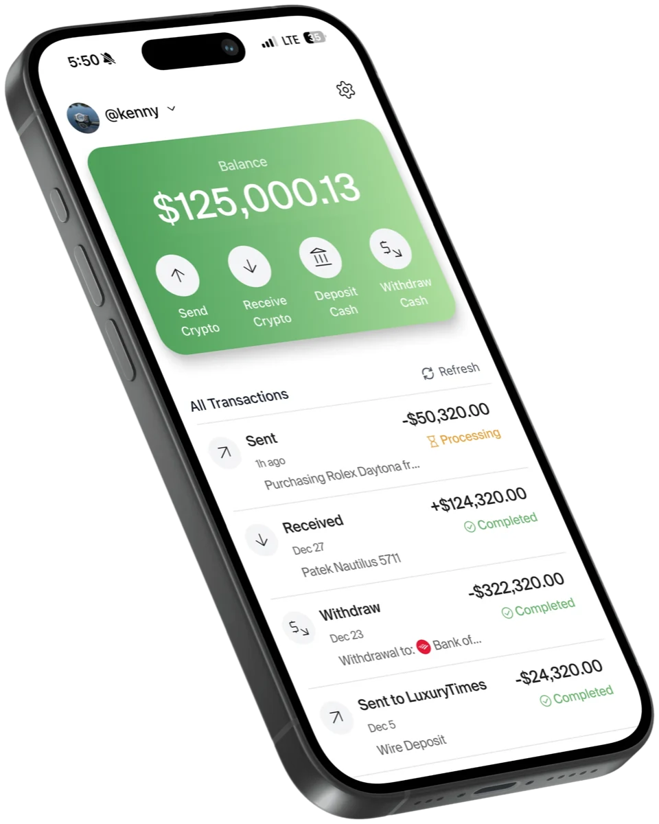
One dollar balance over four money actions: the whole screen a six-figure deal happens on.
Monthly volume · ~100% MoM through its early months
The problem
Six-figure tickets, single-digit margins.
A wire takes days and is final.
So they settle in crypto, and hit two walls.
Retail exchanges fund only from personal accounts. The coin they use, USDT, isn’t offered in New York.
KettlePay: dollar in, dollar out.
Minutes, not days. Whatever the other side sends, any coin, any chain: you hold dollars. 0.75%.
Before any of it, the first artifact wasn’t a flow but a document describing exactly who this is for. Most users are 20-to-60-year-old dealers who have never used a fintech app, let alone a crypto one. Two of them sit at every table: one is comfortable with crypto but lives in fear of a frozen wallet; the other is fiat-native, has been pushed out of traditional banking for being a dealer, and distrusts crypto and us in equal measure. The one thing they share: they will not learn crypto vocabulary. That pre-decided almost every call that followed.
Where the user definition landed
Neither of them will learn crypto vocabulary.
deep diveon the phone
Language
01Dollars, not tokens. “Bitcoin,” not “BTC.”
on the phone
02The button says exactly what it does.
deep dive
Structure
03Money in, one balance, money out.
deep dive
04Three tabs. Money actions go full-screen.
on the phone
05Same keypad, confirm, success in every flow.
on the phone
Protection
06Guards on bank-account add.
deep dive
07Empty states hidden, never grayed-out buttons.
08Numbers sized so seven figures never overflow.
The three cards tagged for a deep dive get one, starting here. Low frequency × catastrophic cost → guard the fat-finger moment.
This doesn't look like a valid routing number. Please double-check.
The checksum runs as the digits go in, and it is the app’s own rule, not a length test: 021000020 is the canonical test routing number with its last digit changed, which is exactly the single-digit typo the rule exists to catch. This one shuts the step.
Are you sure that routing number and account number are the same? This is unusual.
Same screen, second rule. Typing the account number the same as the routing number is unusual rather than impossible, so the app says so and leaves the step open. The warning is the gate; there is no are-you-sure sheet on this screen, and the deck cut the one it had authored for exactly that reason.
Design for those two and the obvious build is a crypto Venmo. But person-to-person transfers are a rounding error here; the real job is money in, money out: a two-port pipe. So KettlePay isn’t a wallet you live inside, it’s a settlement tool you open to close a deal and leave. Balances are held as dollars, the chain stays invisible, and the whole app orbits the in-and-out flows instead of a social feed.
Crypto’s reality does leak in places: a cross-chain send reads “Sent” the instant it leaves but takes minutes to actually arrive, so the interface tells the truth about delivery instead of pretending it’s instant.
The app’s real button label is the amount and nothing else. Peel the word Confirm off and what is under it is the thing that is actually about to happen.
Pull the tape off. Click it, or tab to it and press enter.
The app is three tabs and nothing more: Home, Activity, Me. The money actions aren’t destinations you navigate to; they’re full-screen flows that launch from Home and drop the tab bar so you always know you’re mid-action. Activity is the ledger and the in/out chart. Keeping the surface this small is what lets a first-time user trust it.
That first-time trust has a face. Persona B watches their first six-figure transfer like a hawk, so the app is built to be trusted at a glance: it should feel like an account, not a wallet; there are no surprise states; the balance is always legible; and there’s always a plain-English read on what just happened and what comes next. For this user, confidence, not features, is what makes them stay.
Confidence like that is built by repetition. Every money flow shares one grammar: the same keypad, the same confirm, the same success screen. Send, receive, withdraw, all the same shape. Action screens drop the tab bar so the mode is unmistakable. Send to someone new and the app keeps them. There is no save prompt to answer mid-flow: every counterparty you have sent to is simply there the next time. And numbers are sized so a seven-figure balance never overflows.
Crypto out, to a saved counterparty or a pasted address.
A QR and address; whatever lands is converted to USD on arrival.
The USD balance back out to a linked bank account.
Three different flows · same keypad, same confirm, same success
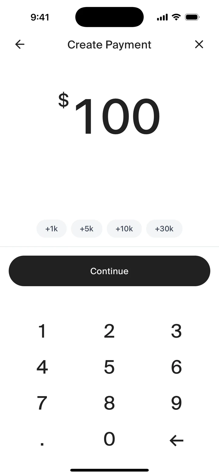
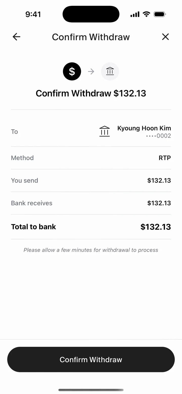
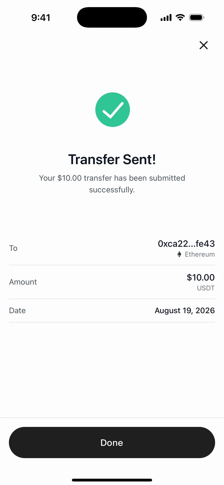
Payment links are shipped code and shipped components; the flag that puts them in the nav is off today, so the receive keypad is reached by route.
Underneath that one grammar, the engineering isn’t always where you’d expect. Matching Home’s branded pull-to-refresh on Activity looked trivial and wasn’t: the problem was what I was animating. Three tries to get it right:
I put an empty box above the list and grew its height with the drag: the layout changed every frame, so every frame re-laid the list out.
That pull-to-refresh story is the whole app in miniature: I built the interface fully before the features filled in behind it, not a pile of features but a UI built whole, with the engineering arriving into a shape that was already proven. Designing the entire surface first surfaced the real grammar and the edge cases early, instead of negotiating the UI screen-by-screen against a backend.
The app built in that order is the one these numbers come from. Both periods are on the card, and the at-launch rows keep full ink rather than stepping back: $1B+ only means anything read against the $100M+ it grew out of.
At launch
Merchants onboarded
0+Volume processed
$0M+Transactions
0+Now
Volume processed
$0B+Monthly volume
$0M+Founding design engineer means owning the whole line, from userbase strategy and IA to interaction, copy, motion, and the React Native that ships it. The method under that is one I write down as skills, gated by explain-diff: it reviews an AI-written diff hunk by hunk and says why each change exists and whether it deserves to. The full write-up is at How I work with Claude.