Rejuvenating a Website
Project Overview
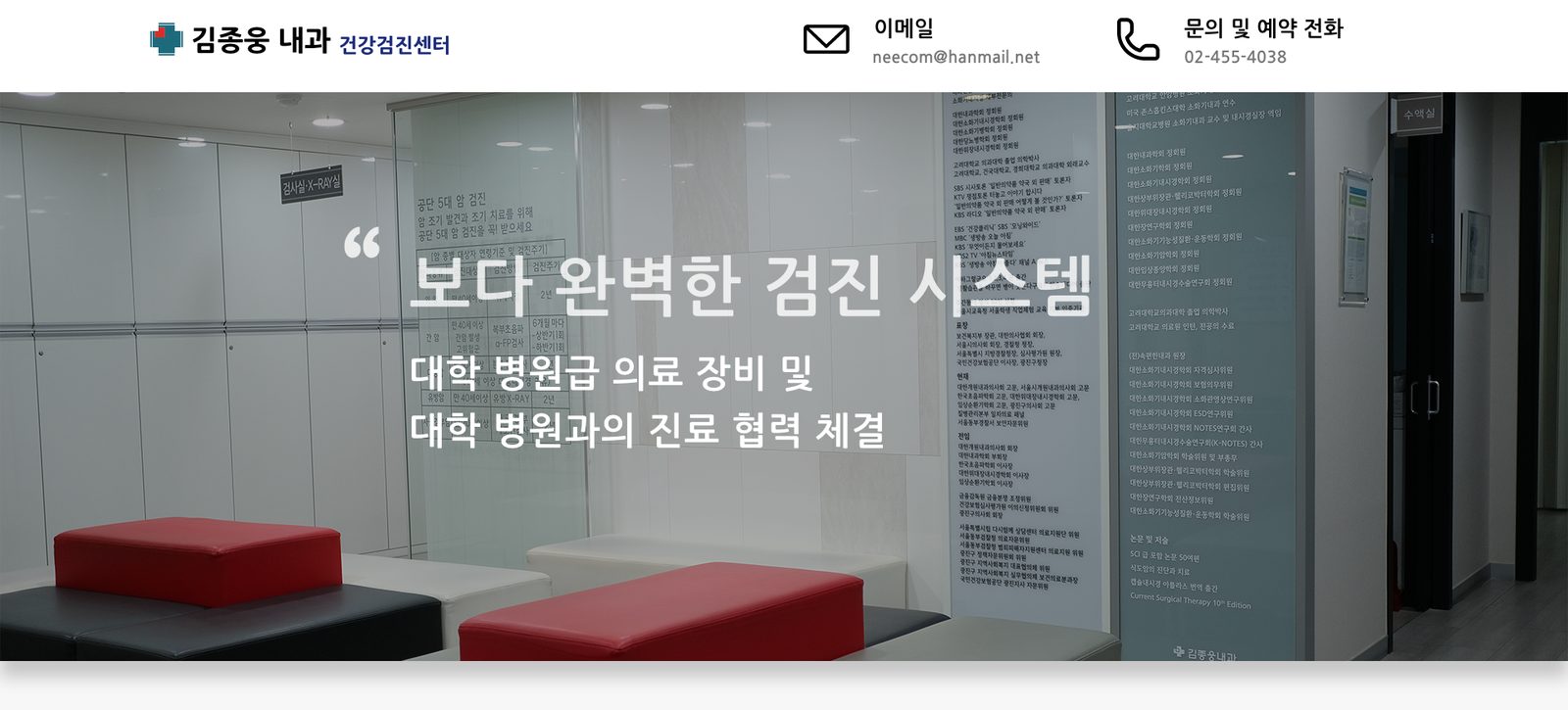
Since we have agreed upon redesigning a website for Kim Jong Woong Internal Medicine located in Seoul, South Korea, we had an opportunity to ponder upon which characteristics of a website make it a "good" one. We had our tool in hands since we have learned how to become a good graphic designer and a typographer. Now we needed to make the website stand out strong by sticking close to its purpose of existence by throughly investigating user needs, and applying our research in a visually effective method.
How it started
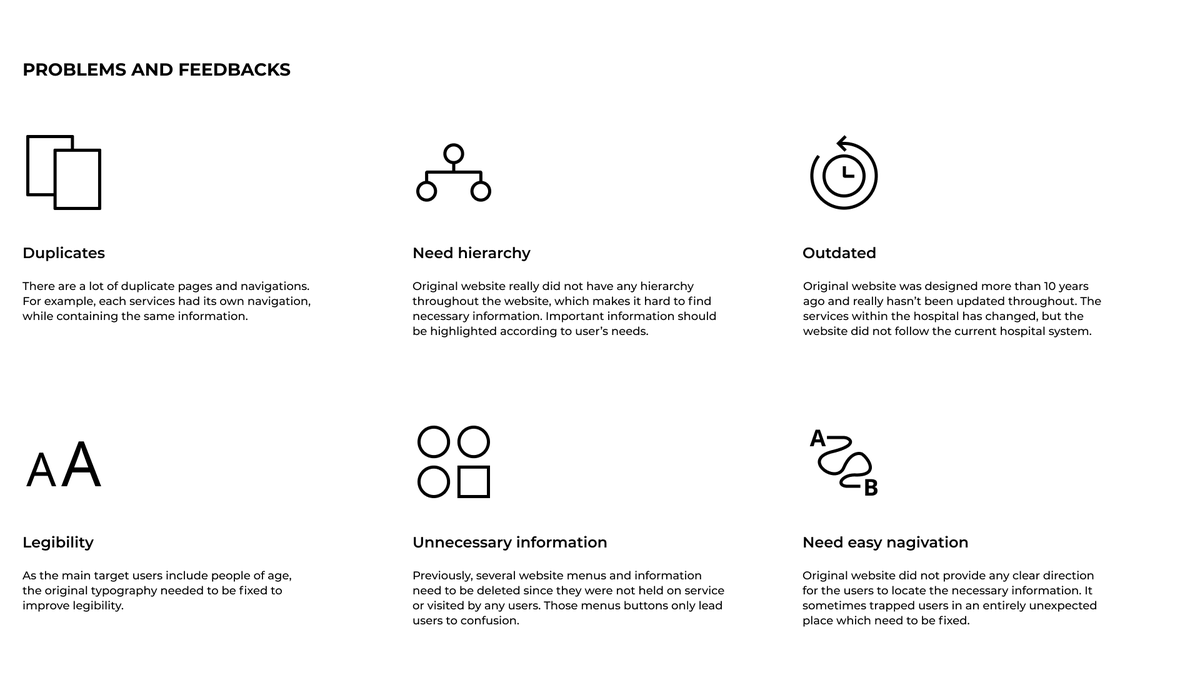
As a product side, we knew how the original website delivered a bad experience to the users. So we wanted to validate that there were problems and ask the users. We wanted to learn about how they find the information they need. Thus we started off by investigating behavior patterns of people on hospital websites. As the hospital notified us that most of the clients are over the age of 50, we had to utilize qualitative research methods to target those specific age groups and state redesign goals.
Redesign Goals
After hearing and seeing the problems, we wanted to redesign a website that is functional and easy to locate information. We wanted to consider all the feedbacks and behavioral patterns of the users when browsing through a hospital website. While removing the duplicates of the pages and improving the legibility, our main focus was to create the most simple user flow by keeping it simple, direct, and functional.
- Information architecture
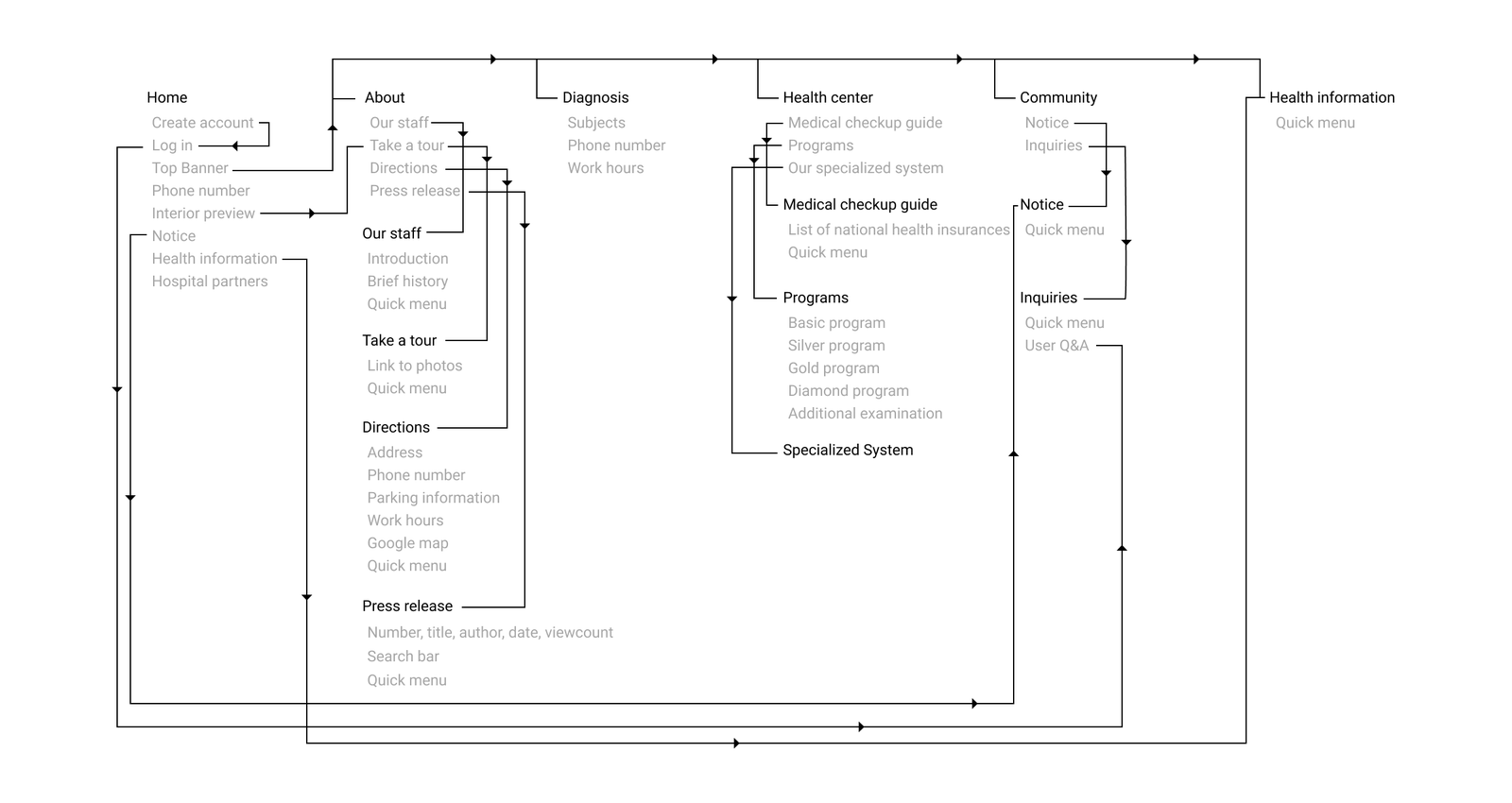
Since there were duplicate pages of same functionality and odd navigating structure, our goal was to have clear and simple information architecture.
- Page layout
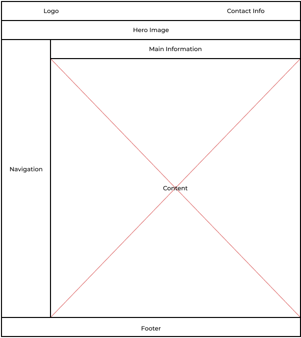
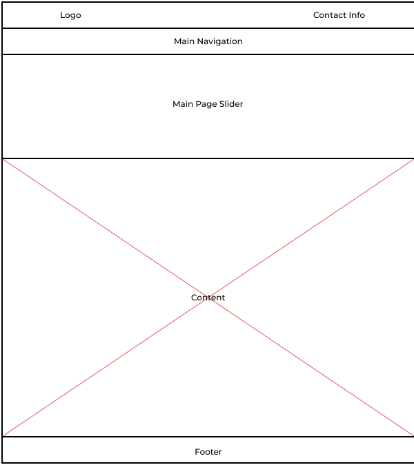
We wanted to have as many little page layouts as possible while keeping the necessary contents. Also, we wanted to change the page layouts according to the behavioral pattern of the users, so the users can find the information they want without a problem.
- Legibility
As the original website lacked hierarchy while the font being small, the patients avoided using the website as they were having trouble with the legibility. We wanted the website to have strong legibility so even people of age could use it without having any problem.
Card Sorting
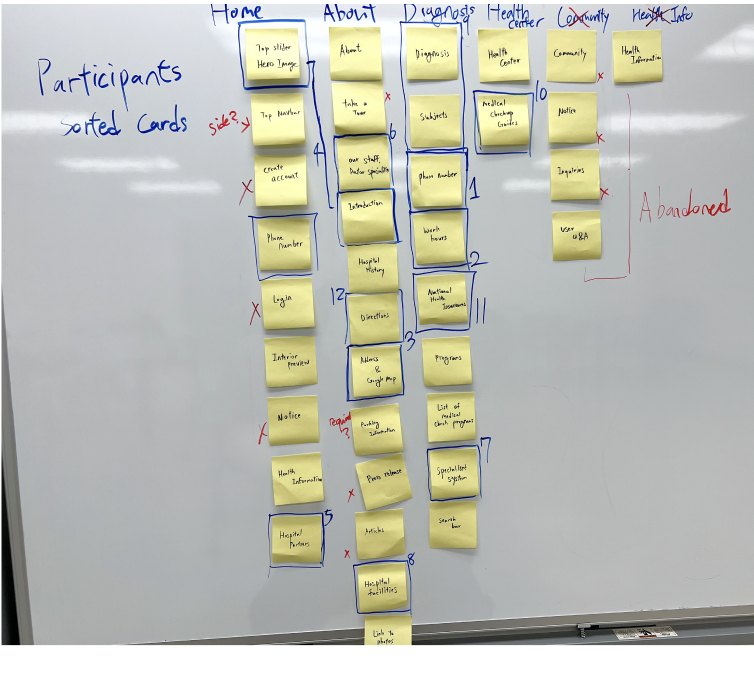
Asking the participants the information they look for in a hospital website
With the consent of the hospital, we first started clearing out unused/outdated/duplicate website functions and information that contributed to complicated web design. Then we asked our participants to prioritize the information they look for in a hospital website. Using a card sorting method, we were able to recreate a user flow that met our redesign goals. We wanted a website with a clear layout, no duplicates, and highlighted essential information.
What did I learn?
What was missing from the original website is how it was built with the task at hand but not recognizing how its numerous design choices did not fit the actual users' needs. We learned that a great product, either physical or digital, is always followed by design choices that are human-centered.