Next.js · TypeScript · GSAP · After Effects · Mapbox
Earn a skeptic’s trust in one glance
The question everything was triaged by
KettlePay pivoted out of an NFT watch marketplace, and the pivot kept its moat: real ties to the watch world and New York’s diamond district. Those dealers source from Hong Kong constantly, the other side increasingly wants USDT, and crypto simply beats a wire for them: money lands faster, with proof, and at a flat fee that is small against the margin dealers put at 5–7% on a six-figure deal. But they were confused by crypto and rightly wary of it.
So the whole site has one job: make a crypto-skeptical luxury dealer trust it at a glance. And for this audience trust is two-sided. It has to feel as safe as a bank, but read as cutting-edge, not old-fashioned. I had two weeks, alone, to design and build it. That constraint became the design tool. Every element was triaged by one question: does this earn trust faster? Everything below is an answer to that, and so is everything I cut.
Why generic reads as untrustworthy
The first thing that question killed was the obvious layout. The default marketing hero, headline left and product shot right, would have read as safe and generic. For people deciding whether to move real money through crypto, “generic” is the opposite of trustworthy: they needed to feel the team was technically ahead. So I deliberately broke that template and let motion and dimensionality carry the credibility, while keeping the surface calm enough to use. Cutting-edge as a trust signal, not as decoration.
Hero: dimension without the download
It starts at the hero. I wanted the app to feel physical the instant you land. First attempt: a true 3D phone in Spline. It looked great and ran badly: a WebGL runtime and a scene file that both had to land and unpack before the phone could appear at all, and jank on scroll. That scene is still on Spline’s CDN, so the cost is not a memory I am asking you to take on faith. It is below, on a button. Second attempt: I built a preloader to cover the wait, but that solved the wrong problem. A first impression that has to load before it can earn trust has already lost. What shipped: a video of the app composited onto a phone, then a single CSS 3D transform. The phone lies tilted back and straightens up to meet you as you scroll. Above it, one rotating word (luxury watches, cars, jewelry, yachts, real estate) says “this is for your world” without a sentence of copy.
Why take three won is an engineering argument: a transform animates on the compositor (no layout, no paint, no main-thread work per frame) and video decodes in hardware, with a poster frame so the first paint waits for nothing. The Spline phone was expensive to download and to run; this one is close to free at both ends. Same dimensional feel, a fraction of the weight.
the shipped hero asset: app footage composited on the phone · one CSS 3D transform, scroll-mapped on the compositor · webm-first dual source, poster-first paint
Feature story: shown, not claimed
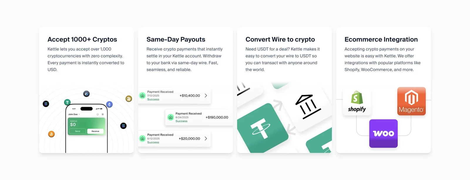
The hero settled the page’s core trade, and the feature story leans on it hardest. A sticky, scroll-paced section walks four capabilities, each shown as real product footage rather than claimed: accept 1000+ cryptos, same-day payouts, wire → USDT (“need USDT for a deal?”, written for the Hong Kong sourcing run), and e-commerce. Rich effects like motion blur are expensive to run live, recomputed every frame on the main thread, the one resource a scroll-driven page can’t spare. So I moved that cost from runtime to render time. Pre-rendered in After Effects, it ships as video the browser decodes in hardware. That trades CPU for bandwidth, so the bandwidth had to be engineered too: webm-first dual-source files (the 1000-crypto clip is 344 KB as webm vs the 5.8 MB mp4 fallback), lazy-loaded on scroll-in so none of it competes with the first impression. Immersive, but it still loads like a brochure.
Feature story · real product footage
Four capabilities, walked one at a time by the scroll, each proved by footage instead of a sentence.
1000+ cryptos: the smoothness is the claim
Of those four, one gets proven live instead of baked to video. The claim is “any coin your buyer holds, zero friction.” A wheel that stutters would contradict that sentence, so the one non-negotiable was an endless, perfectly even glide that also responds to your scroll. The smoothness carries the meaning. Under the hood it’s deliberately one number: a scroll offset advanced by the clock each frame and nudged by your own scrolling, applied as a single transform to a tripled list that wraps without a seam. Everything visual is transform and opacity, nothing forces layout, and the speed is time-based, so even a dropped frame can’t change the pace. This is the actual component from the site, running live:
The shipped component · Running live
Accept 1000+ cryptocurrencies
Your customers can pay with any crypto they hold and you receive the USD equivalent instantly.
Bitcoin
Ethereum
USDC
USDT
USDe
Solana
Pepe
Dai
Bitcoin
Ethereum
USDC
USDT
USDe
Solana
Pepe
Dai
Bitcoin
Ethereum
USDC
USDT
USDe
Solana
Pepe
Dai
time-based glide: a dropped frame can't change the pace · transform/opacity only · tripled list, seamless wrap · the actual shipped component
Momentum, in front of a cautious buyer
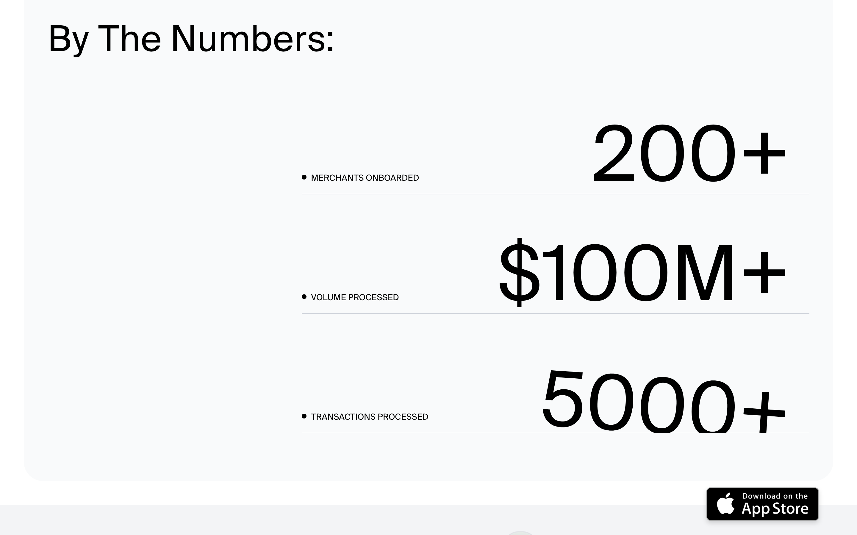
The same logic governs the numbers. Sitting still, they read as a screenshot; on the site they count up as they enter(200+ merchants, $100M+ processed, 5000+ transactions at launch), so the traction read as momentum, the feeling a young payments company wants in front of a cautious buyer. It’s also the cheapest motion on the site: one trigger, one eased count, nothing but text repainting. A counter that janks is a counter arguing against the product.
Traction · by the numbers
A still of a panel that moves: on the site each number counts up as it enters, so the traction reads as momentum.
How it works: banking words, crypto invisible
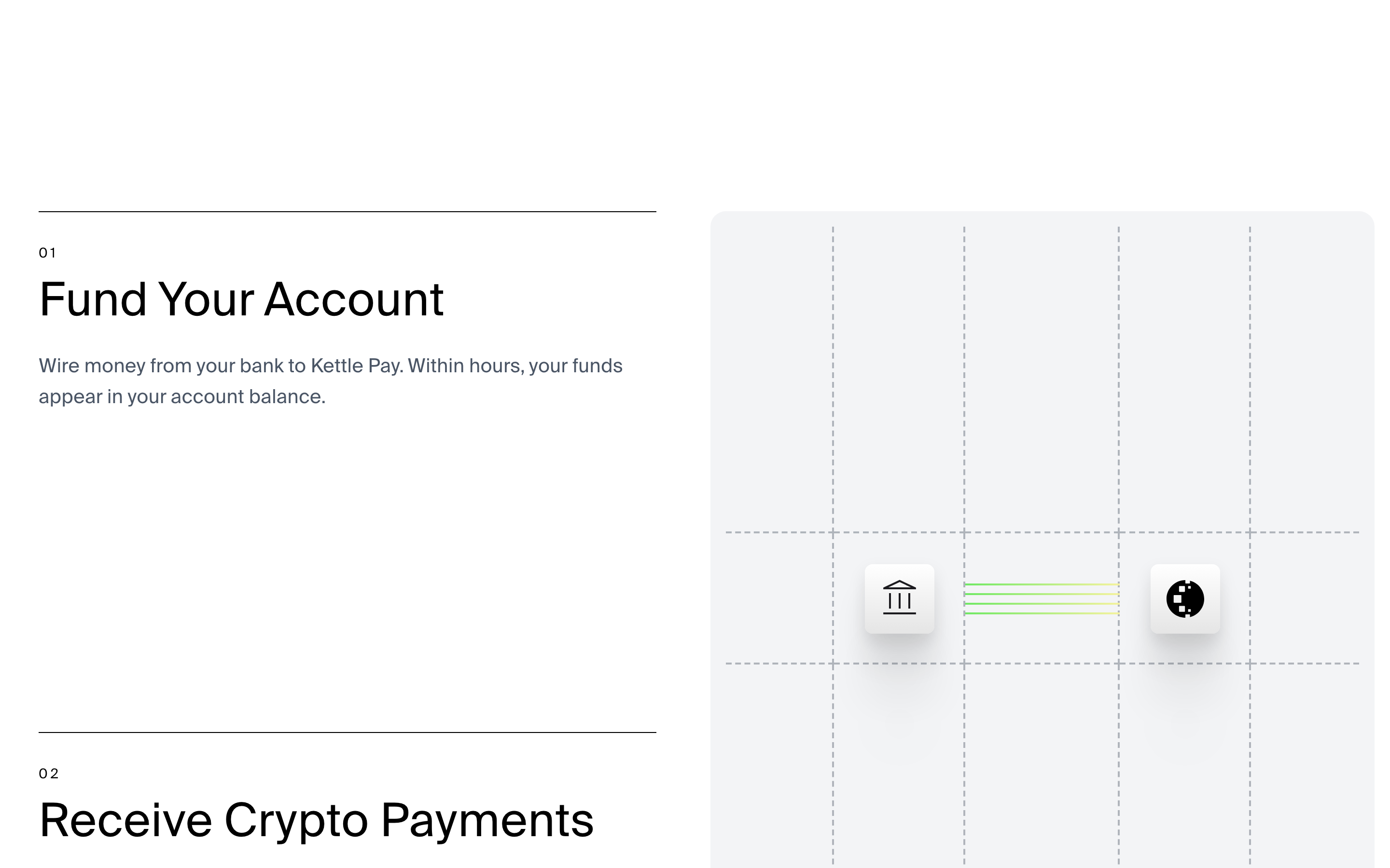
If the counters sold momentum, this is the “safe as a bank” half of the thesis, expressed as information architecture. Dealers think in wires, balances, and withdrawals. Not wallets, gas, or chains. The interactive rail keeps the entire flow in their vocabulary: wire in → get paid in any coin (instantly USD) → wire out, often same-day → one flat 0.75% fee. The crypto happens in the middle, invisibly. And like every animated explainer here, the rail is paced by scroll rather than a clock: the reader’s own pace is the timeline, so the argument can never move faster than the person it has to convince.
How it works · the interactive rail
Step 01 of four; the whole rail stays in the dealer’s words, wire in to wire out, with the crypto invisible in the middle.
Security: making “we block it” visible
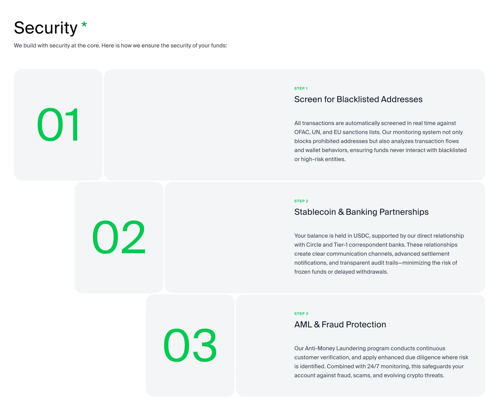
Safety’s hardest word is security, and it’s where crypto sites usually lose a skeptic, in a wall of compliance text. Instead the section makes the guarding visible: scroll-driven bars and Lottie that grow as you read, turning sanctions screening, Circle & Tier-1 banking, and AML into something you watch working. The interaction is the diagram, and it reassures without shouting. Lottie earns its place here for the same budget reason the demos are webm: flat vector marks ship as kilobytes of keyframes, motion-blurred footage ships as video. Each section gets whichever format makes its pixels cheapest.
Security · sanctions, banking, AML
The three steps grow as you read them, so the guarding is visible rather than argued in a wall of text.
The moat made personal
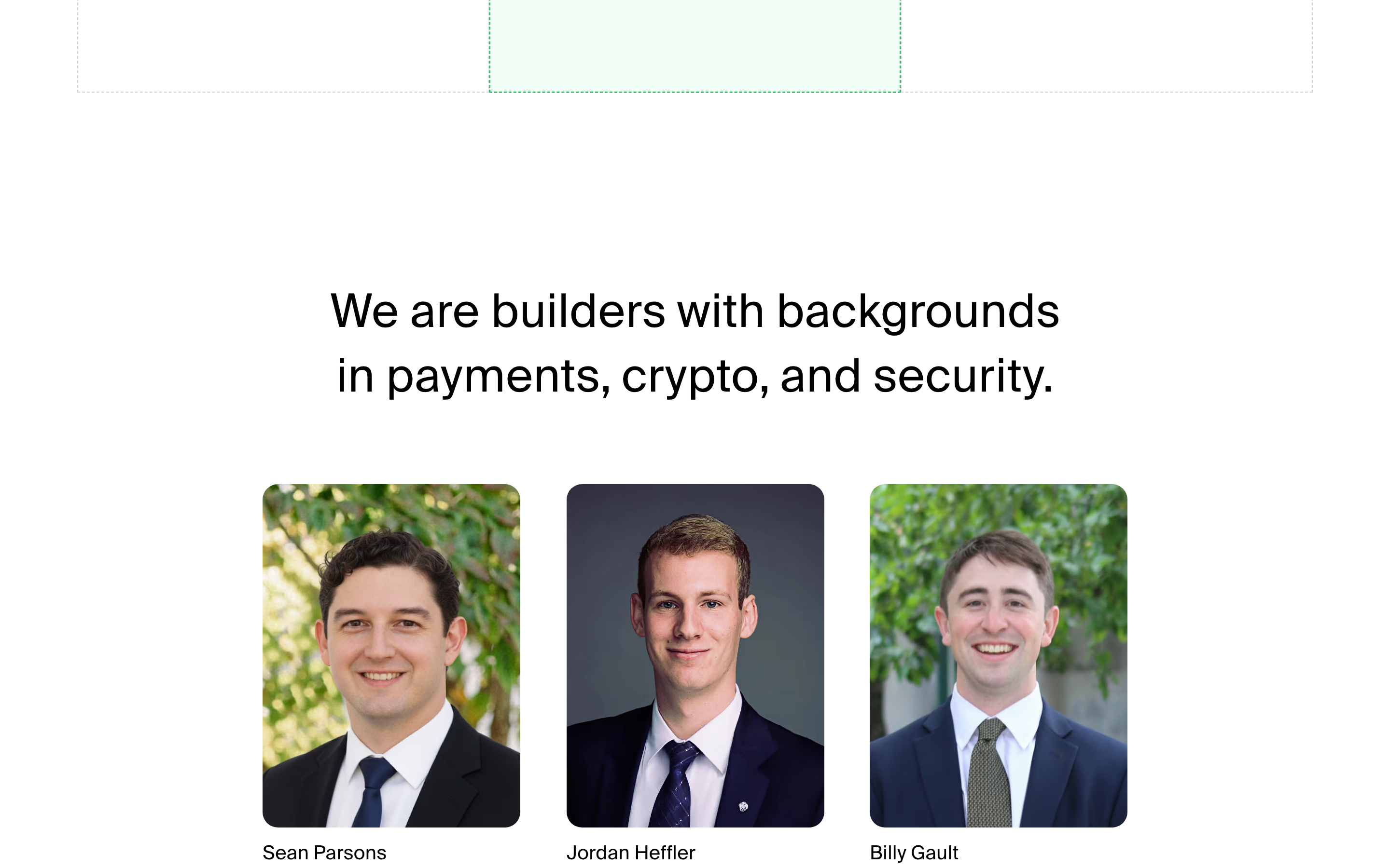
Past the process, the last question on a five-figure-and-up transfer is who you’re trusting. The about page lands on the team and the investors (ParaFi, Kronos, IOSG, Signum, Zee Prime, Puzzle): the moat made personal, and the final beat of the trust argument.
The people behind it · team and investors
The about page’s last panel: after the process, the argument ends on who you’re trusting.
The set piece I built, then benched
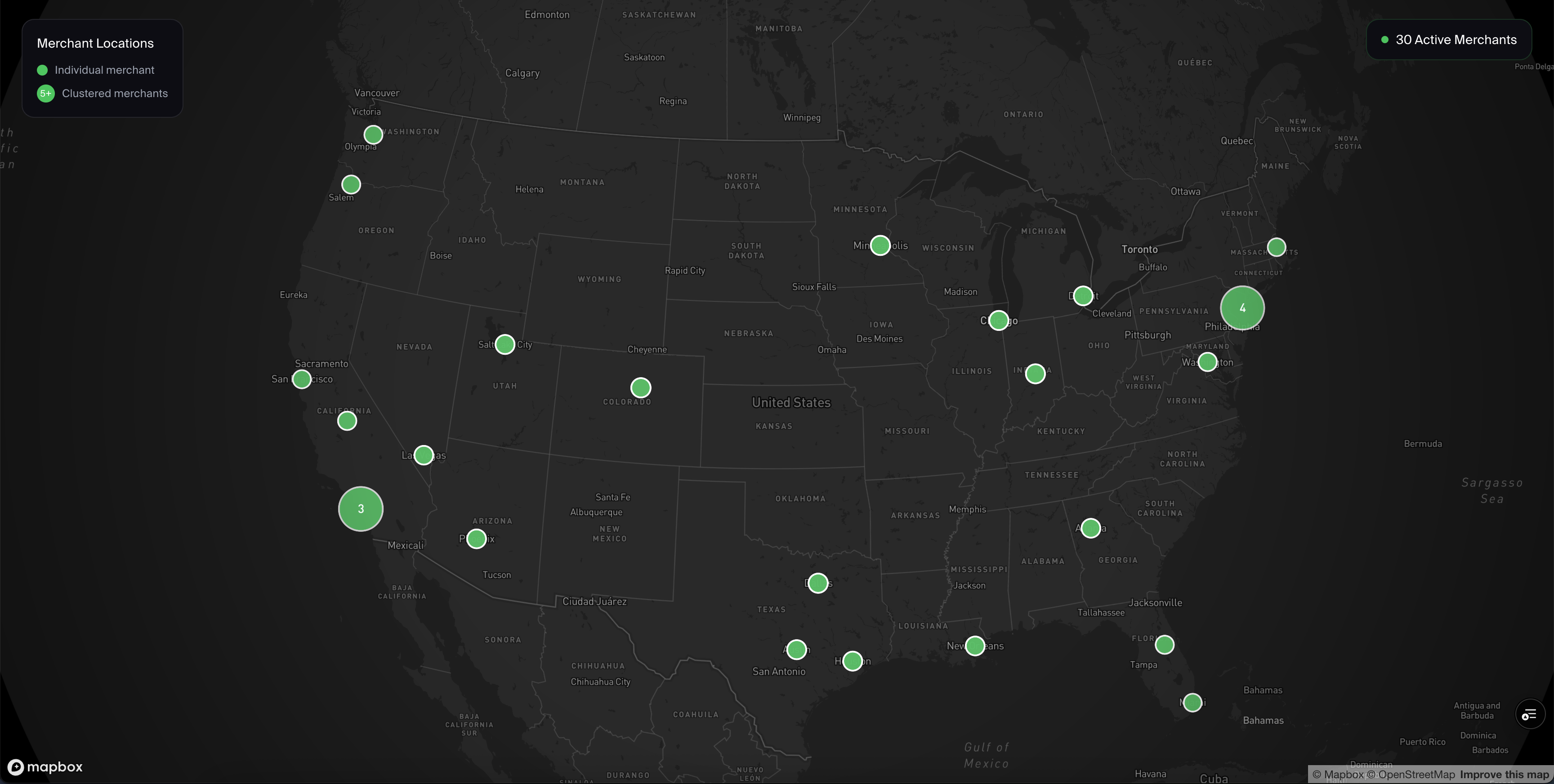
The triage cut one more thing, and it was my best one. There’s a Mapbox hero where “meet our merchants” splits apart as the camera dives into the network, the diamond-district moat made tangible (shown here as the static frame, since it ships unlinked from the nav, on purpose). It’s heavy in a way no optimization rescues: a WebGL map runtime plus tile fetches before the camera even moves. On a site whose entire job is trust-at-a-glance, weight is the enemy of the first impression. Wow isn’t worth more than speed. Deciding not to feature my most impressive build was the same judgment call as cutting the Spline hero. Restraint was the design.
Mapbox hero · the static frame
Unlinked from the nav, so its weight never reaches the first impression.
benched on purpose: a WebGL map runtime + tile fetches no optimization rescues · restraint was the design
A year later, the same argument in emerald.
Era 2: the same argument, restated (May 2026)
A year in, that restraint got a second pass. I rebuilt the site on a design system of my own (~40 --kp-* tokens, Geist with a Cormorant italic accent). The same trust argument, restated in emerald. The rules got sharper, not looser: I removed ~293KB of unused font preloads that were starving the real LCP text on slow connections. And the one third-party seam in the funnel got closed. The Cal.com embed was replaced with a scheduler I built end-to-end: real free/busy against Google Calendar, Meet links, and timezone math handled properly. Below is that scheduler’s mechanic as a working demo: the availability is mock, the timezone logic is real. Change the zone and watch the same slots restate themselves.
replaced the Cal.com embed · slots are UTC instants: every zone renders via Intl · zero third-party JS · mock availability
A competent default in minutes. The day went into taste.
Era 3: where the day actually went (June 2026)
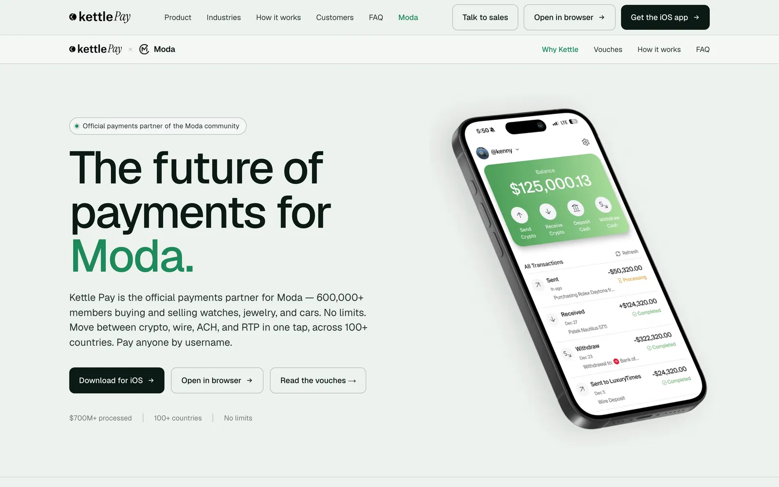
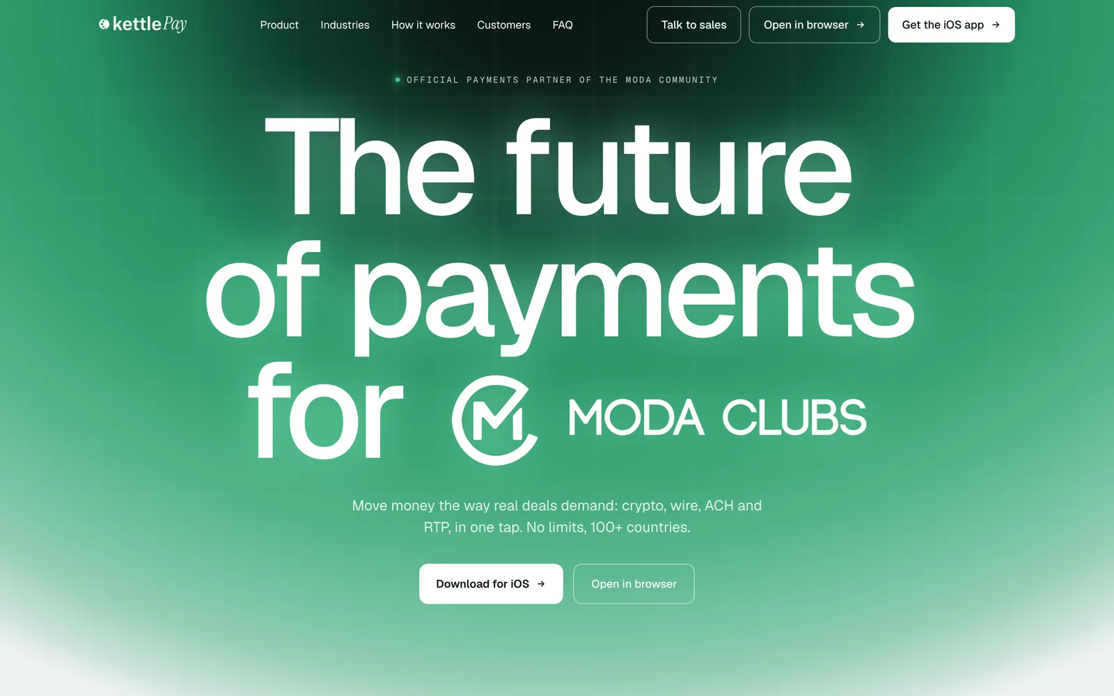
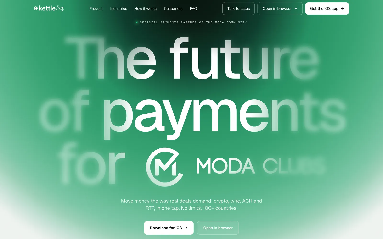
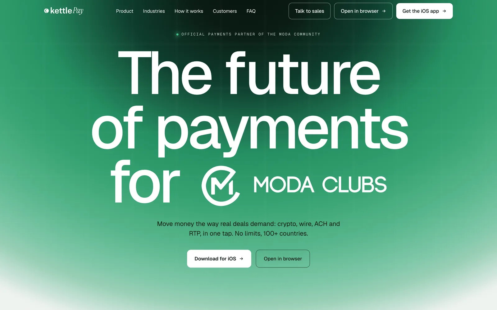
A month after that rebuild, Kettle and Moda shipped a co-branded page together, and I built it in a day. The frame on the left is where it started: a conventional split hero with a stock phone render, generated from the brief in minutes. Everything between that and the frame on the right is direction, and that is where the day actually went.
AI first pass · Jun 22
Final · Jun 30
Left: the route’s first commit, generated in minutes. Right: the hero after the day of passes. Both are the real page at those commits, not mockups.
Not a restyle. A rewrite.
Editing, not styling
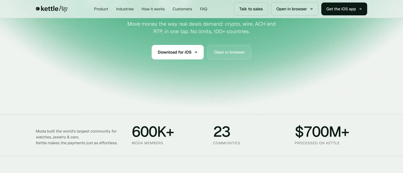
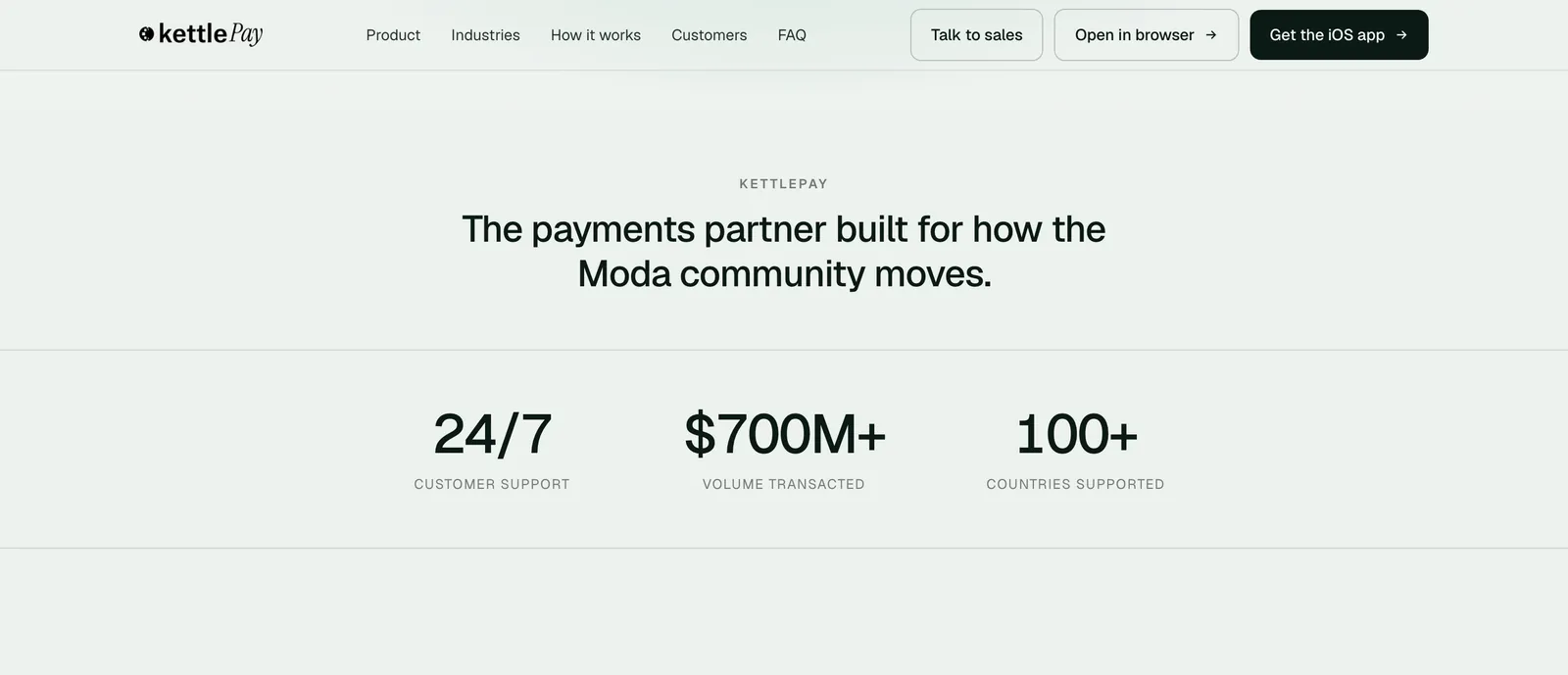
The sharpest instance of that direction is the stats band. Both captures are the same window of the page one stage apart, so the only thing separating them is the edit: the numbers changed, the line over them changed, and a row that had a paragraph jammed into its first cell became something a buyer reads in one pass.
Before · Stage 01
After · Stage 02
The AI draft’s numbers and copy were wrong for this buyer, so I replaced them: three numbers, one line.
The day, in five passes.
Only the design change moves
Each stop below is one design call on the same page. Every frame is the page checked out at that commit, so what moves between two frames is the design change and nothing else.
The numbering skips 02 on purpose: that stage barely touches the hero, because its change is the stats band above.
The method under those passes, an agent first pass and then the day of taste on top, is one I write down as skills, gated by explain-diff: it reviews an AI-written diff hunk by hunk and says why each change exists and whether it deserves to. The full write-up is at How I work with Claude.
“sharp white at all times instead of a blurred layer revealed under the cursor” · e099b35
Mint glow, white sub and CTA
“restores the depth the removed cursor spotlight gave” · 591c745
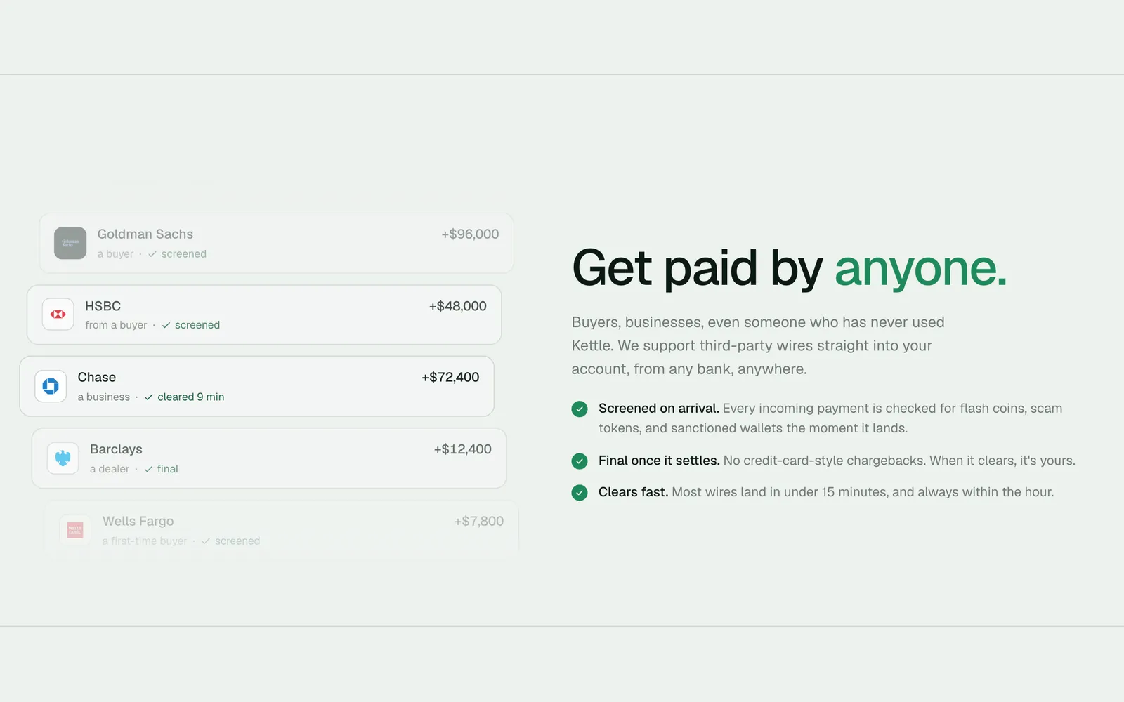
“Get paid by anyone” wire feed
“Add "Get paid by anyone" third-party-wires section after Features” · c4a523b
What shipped
Two weeks, solo, design and code: a front door where every interaction makes one argument (presentation, proof, effortlessness, momentum, familiarity, safety, people), and where the cuts (Spline, the map, live effects traded for baked video) make the same argument by protecting the first impression. The bet was that, for this audience, how the site is engineered is itself the proof the money is safe. Underneath, three rules every section follows: keep per-frame work off the main thread, ship each effect in whichever format makes it cheapest, and let nothing stand between the visitor and the first paint. The app it fronts now moves $300M+ a month.
Two more eras followed on the same argument: May 2026 restated it in emerald on a design system of my own, and the co-branded Moda microsite shipped on Jun 30, where a competent default arrived in minutes and the day went into taste. That day is on this page in full, pass by pass, down to the stats band rewritten so a buyer reads it in one pass.